Log Notes editing?
-
Ok, we have just deployed a completely revamped experience for notes on tracking pages! Here are the new features:
- Rich Text Editor: You can now style your notes with bold, italic, bullet points, ordered lists, and even add hyperlinks using our new editor!
- Comprehensive Voyage History: View the entire history of your voyage through notes in a single pane that opens separately and displays them in chronological order.
- Direct Comment Linking: Easily link directly to specific comments. Just click on the comment, copy the address from the address bar, and share! Here’s an example: Direct link to your latest entry.
- Editable Notes: All notes, including moorage and stay notes, can now be edited directly from the tracking page. Simply click the edit button next to the note’s title.
This major improvement aims to enhance your user experience, and we may introduce more iterative changes over time.
In the meantime, welcome to to explore these new features and share your feedback with us!
-
We also just added the capability to add photos to your notes! While the UI enhancements are still in progress and the full feature is not yet complete, you can already start uploading photos directly from your tracking page.
Check out this example from our boat: https://saillogger.com/svrenaissance#notes
-
I'm already uploading my photos!
One thing that would be interesting to consider is the log entries and how they show up / do not show up. I don't use notes as much while underway as I am pretty sensitive to seasickness and screens are a trigger sometimes to causing that to happen. However, I do put notes in my logs about the day, weather, etc. It could be an option to turn on log entries to show here in case folks log things they don't want public? Or some other approach?
-
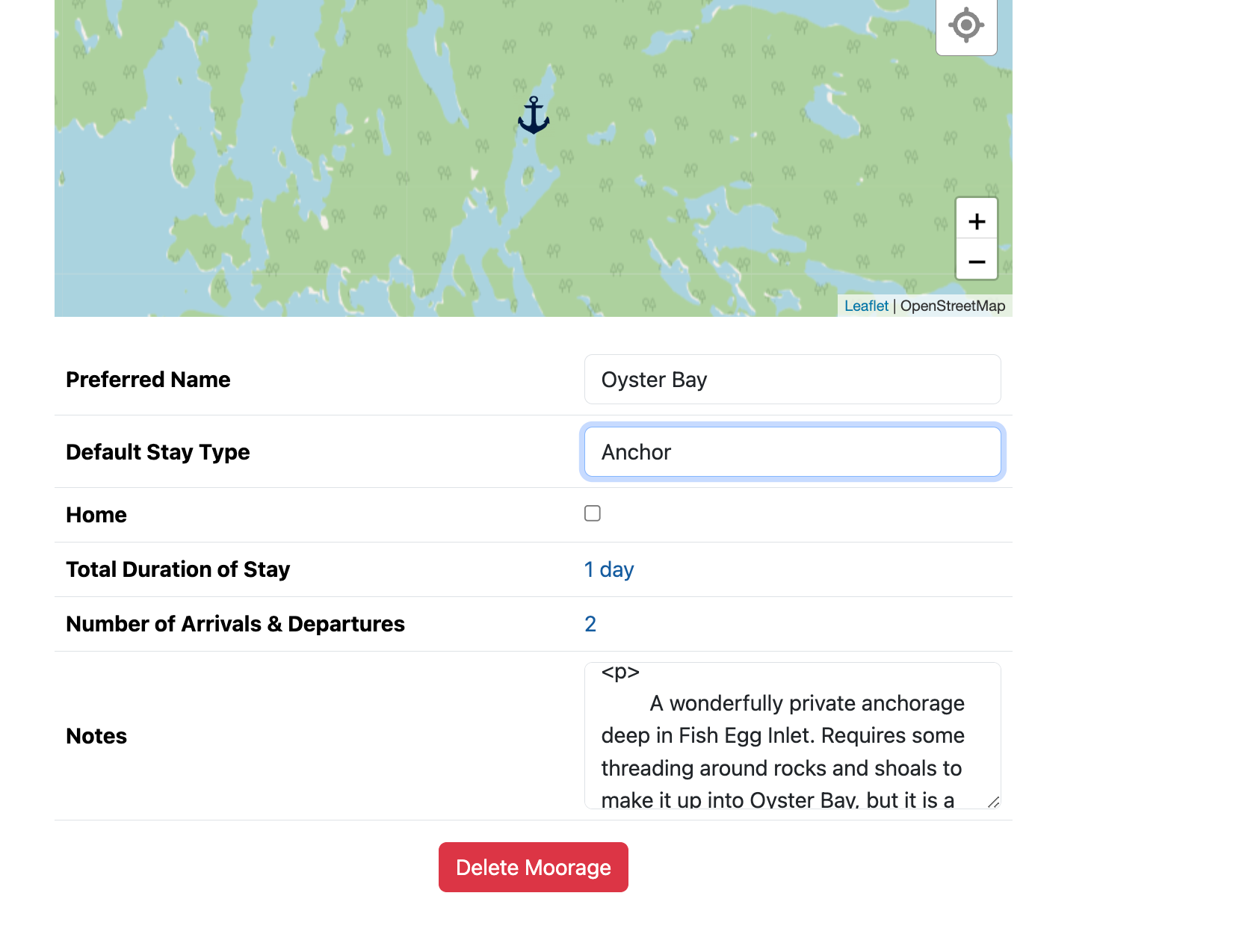
I noticed when I go to a moorage page now, if I have edited the moorage in the new notes interface, it appears HTML has made it into the field. I am guessing you're planning on updating this editor to the new one, but just in case someone else sees it:

-
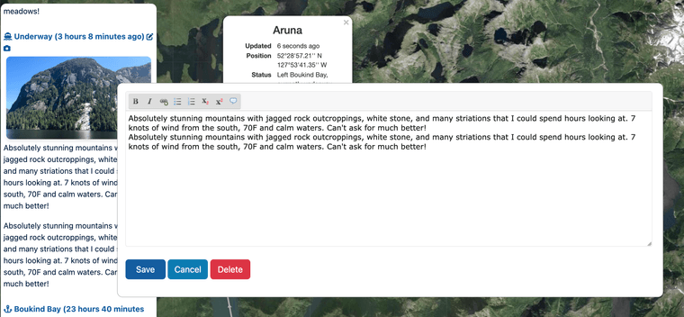
I also noticed a duplication on an underway note. I am using both the website and the app, and I forget if I uploaded the picture via the app, and typed in the initial note with the computer, but somehow the text was duplicated.

-
@stevemitchell said in Log Notes editing?:
I noticed when I go to a moorage page now, if I have edited the moorage in the new notes interface, it appears HTML has made it into the field. I am guessing you're planning on updating this editor to the new one, but just in case someone else sees it:

Yes, this is expected for now and temporary. Not all editors support the rich format yet. They will all be upgraded to the rich text editor within a couple of days.
-
@stevemitchell said in Log Notes editing?:
I also noticed a duplication on an underway note. I am using both the website and the app, and I forget if I uploaded the picture via the app, and typed in the initial note with the computer, but somehow the text was duplicated.

This is odd. If it is reproducible, steps to reproduce would be super helpful. I couldn't reproduce in my few immediate attempts.
Also using the app and website should not matter, they hit the same backend, so whatever the problem is, I suspect it has something to do with the sequence of events.
-
Thanks for the updates! I'll kill off the dupe entry on the one post. Looking forward to additional features and tweaks!
-
We are enjoying the new notes editor, thanks again for the really great update.
One request please: Can you please move and/or change the color of the "Cancel" button? It's proximity and similar colors to "Save" have led to more than a few deleted notes which has been frustrating. Ideally if one were to press cancel or delete there would be a second "Are you sure" confirmation.
-
@SV_Atlas said in Log Notes editing?:
We are enjoying the new notes editor, thanks again for the really great update.
One request please: Can you please move and/or change the color of the "Cancel" button? It's proximity and similar colors to "Save" have led to more than a few deleted notes which has been frustrating. Ideally if one were to press cancel or delete there would be a second "Are you sure" confirmation.
We re-aligned save to the left and cancel/delete actions to the right, this should create enough spacing and hopefully avoid accidental cancellations.
BTW, for delete, there is already a confirmation but we think it will be an overkill for cancel.
